Responsive style 👗
Thanks to the Muuri layout engine, you can create any type of layout and size the Items as desired simply by setting the CSS style (width, height, margin and padding).
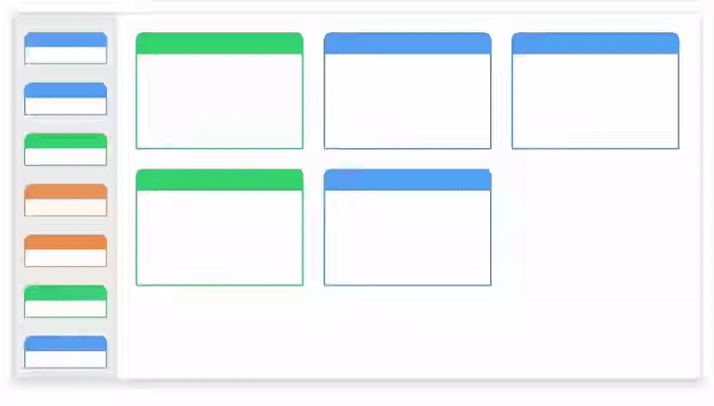
A very common case is to use the MuuriComponent as a grid divided into equal cells, and to position each Item in one or more cells. The implementation would be very simple:
info
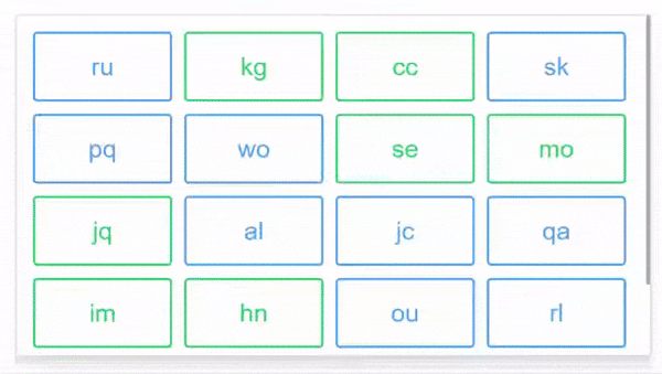
If you need 4 columns, and an Item on each column, just use width: 25%; in the style of the Items. Very simple and effective.
If you want to create more dynamic styles by managing them directly in the component, Muuri-react provides two extremely simple utilities to generate the style of the Items in these cases.
Utility: getResponsiveStyle 📦
With this utility you can virtually divide the MuuriComponent into columns and set the Item to be as wide as n of these columns. In addition you can also set the margin (static or dynamic), the width / height ratio (dynamic) or the height (static).
So you just need to apply the style. The inner element must have position: absolute;.
The utility does not take into account the border for the outer element, you can use the border in a descending element (or change box-sizing).
Utility: getStaticStyle 📦
When dragging an Item with dimensions relative to the MuuriComponent (e.g. width: 25%), the dragFixed prop is used to fix its dimensions (see more here).
This utility offers more flexibility than dragFixed and can be useful in cases where the Item has to be dragged between different MuuriComponents and assume different sizes (as in the gif).
Gotchas: overflow 🔥
Let's say you have a overflow-y: auto; element, which you use as a scroll container. The MuuriComponent is as wide as the container, the items have width: 25%;. In each row there should be 4 Items.
When the app starts, this happens:
- The MuuriComponent is initially 100px wide, the Items will be 25px wide.
- The Items are many and the MuuriComponent do not fit in the container, the scrollbar appears.
- The width of the MuuriComponent decreases because of the scrollbar, let's say about 90px.
- The CSS engine does NOT update the Items size which remain at 25px, causing an unwanted layout.
The size of the Items will be updated (by the CSS engine) to 22.5px only after a window resizing event.
When
This problem occurs when relative sizes are used (e.g. width: 25%;) and the scrollbar appears / disappears.
danger
Be careful that the problem does not arise immediately, in fact the first layout is calculated correctly before the scrollbar appears. However, when the layout is recalculated with the scrollbar present, for example following a drag, the Muuri engine will find the Muuricomponent 90px wide and the items 25px wide. In the new layout there will therefore be 3 items per row.
solution
One possible solution is to use overflox-y: scroll to make the scroll bar fixed. Check here for other possible solutions.