Drag and drop ✋
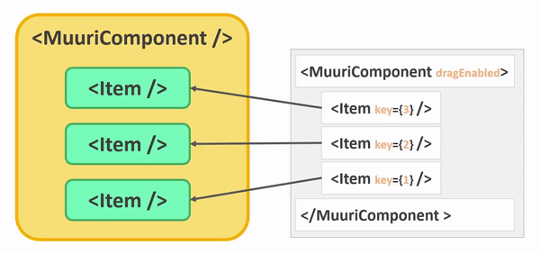
Muuri-react stands out from many other libraries for its simplicity, drag and drop is no exception. To manage drag‑and‑drop you have to enable it and... that's it 🤯! The Items are the components that can be dragged, the MuuriComponent represents the container in which the Items can be dropped.
This chapter lists the possible uses and configurations, if you want to use drag-and-drop between different MuuriComponents see the Reparenting chapter.
Enabling
To enable the dragging of the Items just use the dragEnabled prop, it can be enabled/disabled in any re-render.
Hook: useDraggable 🔌
If dragging is enabled it is also possible to disable it to a single Item through the useDraggable hook.
Hook: useDrag 🔌
The useDrag hook allow you to know if the Item is being dragged. The Item will re-render on each drag start/end.
Style 👗
You can change the style of the dragged Item also by applying the style in the CSS class.
Drag container 📦
You can choose the dragContainer in which the dragged Item should be appended to for the duration of the drag. The default one is the MuuriComponent element.
Drag handle 📍
You can choose The element within the Item element that should be used as the dragHandle by providing a CSS selector.
Drag axis 🧭
You can force Items to be moved only vertically or horizontally when dragged with the dragAxis prop.
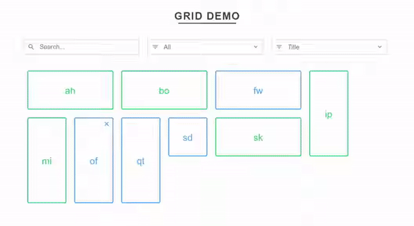
Drag placeholder 👥
If you want a placeholder Item to appear for the duration of an Item's drag & drop procedure (as in the gif above) you can enable and configure through the dragPlaceholder prop.
Drag start 🏁
You can totally customize the drag start logic by providing a function to the dragStartPredicate prop. When the user starts to drag an Item this predicate function will be called. If you return true the Item will begin to move whenever the Item is dragged. If you return false the Item will not be moved at all.
Drag fixed 📌
If the items have relative dimensions that you want to fix during the drag you can use the dragFixed prop. See more here.
Customization ⚙️
You can edit many other aspects of dragging through the following MuuriComponent props:
How is that possible? 🤨
If you've ever used other libraries with drag-and-drop, like the fantastic react-beatiful-dnd, you may have noticed that there is no requirement to synchronize the sorting of the components after a drag event. This is because the sorting of the components is separated from the sorting of the elements in the DOM, so you will never have to sort the Item components. This allows for excellent performance and a very simple implementation.